
Hands On San Diego
Building Community Engagement and Improving the Prospective Sponsor Experience

Role:
Visual/UX Designer
Project Type:
Social Media Strategy, Web Page
Tools:
Figma, Adobe Photoshop, Canva, Illustrator
HandsOn San Diego's mission is to strengthen communities through volunteer action. They believe that when individuals are actively engaged, communities are stronger. They envision a thriving community where everyone is empowered to actively participate in creating positive change without barriers.
As a visual designer, I developed social media strategy and graphic templates on Canva, as well as collaborated with the UX team to design pages for the organization’s sponsorship page.
Challenges → Solutions
Sustainable Strategy for A Small Team
Designed templates with multiple use cases to ease content creation process
Created and followed a posting schedule that aligned with template use
Lack of Engaging and Diverse Content
Created new content types based on user survery insights, such as upcoming schedules
Made graphics more picture-forward, featuring photos from events, aligning with user desires.
Social Media Strategy
Research/Analysis
We analyzed both HandsOn's present social media presence and content, and other similar nonprofit organization social medias in order to understand how to improve HandsOn's outreach, and what made other organizations successful on social media.

SWOT Analysis of HOSD Social Media: Low discoverability due to inconsistent metrics hurt audience retention

Competitive analysis of similar non-profits' social media: Organizations with the most success were those that posted consistent, diverse content
After conducting our SWOT and competitive analyses of other organization's social medias, we decided that we could make graphics more picture-forward, ensure consistent tone in visuals and captions, and help with the frequency of posts.
Solution
Based on our findings from the SWOT and competitive analyses, we came up with a multi-faceted solution to refresh visuals and ensure consistent content rollout. We created a weekly schedule to plan out when and what content we'd post. We also revamped graphic layouts and caption guidelines to ensure tone and visual consistency. We created templates on Canva to produce formats that would emphasize the pictures in each post.
With our new content schedule, we introduced a new type of carousel post that featured upcoming events with low sign ups. This post was meant to boost event awareness outside of the website and attract sign-ups. The templates were made on Canva, so each week the images and event names were updated to highlight new events each week.

Upcoming Opportunities Carousel
We also made a graphic template to highlight individual upcoming or past events. We wanted to showcase the impact of past projects and also highlight bigger upcoming events to increase community awarenesss and participation.
We added our design templates and caption guidelines to the HOSD brand guidelines.

Event Spotlight Post

Social Media Grid following Content Schedule

Impact Across Platforms: Increased reach, engagement, and impressions across Facebook, Instagram, and LinkedIn, with the most notable improvement on Linkedin
Sponsorship Page
We were also tasked with creating the sponsorship page for the HandsOn San Diego website. The Sponsorship Page is still a work in progress for the nonprofit, as they are finalizing the details. This page will allow businesses to sponsor the organization, helping them recoup funds lost from offering compensated membership fees. Different sponsorship types will have unique fee structures.
To help us design our sponsorship page, we conducted a competiitve analysis of other similar non-profit organizations to see what common features were on sponsorship pages. We took note of features that appeared across websites, as well as areas of improvement, and incorporated them into our designs.

Competitive Analysis
Design Iterations
Based on on insights gained from the competitive analysis, we made rapid fire wireframes and low-fidelity designs in 3 different formats so we could test out different features and layouts for the overall flow. After these initial designs, we conducted a design critique to discuss and find ways to improve our designs before our next iteration.

Low Fidelity Iterations
Through the design critique, we identified improvements in spacing, text distribution, and color blocking to improve the readability and clarity of our designs. Between all three designs, we identified the most effective elements to construct an effective high fidelity to move forward with:
Introduction to the sponsorship program
Why partner with us section
Tier levels & benefit
Footer with sponsor logos

Mid Fidelity Iterations with Critique Notes
High Fidelity Design
Our high fidelity design combined the strengths of our previous iterations and synthesized them together, as well as aspects from the design critique that we wanted to include.
We added an introductory blurb about the sponsorship program at the top and utilized visual elements to brighten up the page and tell organizations why they should sponsor HandsOn San Diego.

Intro Section + Why Partner with Us Section Close Up
We utilized a card system to organize donation tiers. We also included the sponsorship form directly on the page for easy access to potential donors eliminating unnecessary extra steps.
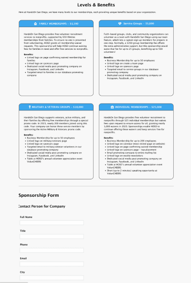
Levels and Benefits Section + Partnership Form

High Fidelity Design Full Page
Due to time constraints, we were unable to fully implement the Sponsorship Page into the HandsOn San Diego website. We also worked on designing a new calender page for events but that was also not implemented due to time and development constraits.